No.4 Clifton Village
Bristol based restaurant, No.4 Clifton Village, required specific campaign branding for tasting evenings that felt elevated, in tune with its premium dining experience while reinforcing their distinctive and recognisable identity.
Campaign Design

Project Overview
Client: No.4 Clifton Village
Industry: Hospitality / Fine Dining
Goal: To drive footfall and ticket sales through a rolling calendar of in-venue promotions, events and seasonal campaigns: each with its own identity, but all need to be recognisably No.4.
No.4 Clifton Village runs a constant calendar of reasons to come in, some of these include free-to-attend weekly promotions like Wednesday wine nights or ticketed seasonal events like Burns Night.
Every event needs its own distinct energy while staying unmistakably No.4. Whatever the format, flyer, menu, poster, or A-board, the job is the same: get people through the door.
I work through each concept directly with the venue, hearing what they want and shaping it together, before taking on every physical touchpoint myself, from A-boards to menus and place cards. I then create the assets the wider team uses across social, web, and adverts.
Below are a few campaigns from this ongoing series.
Wednesday Wine Club
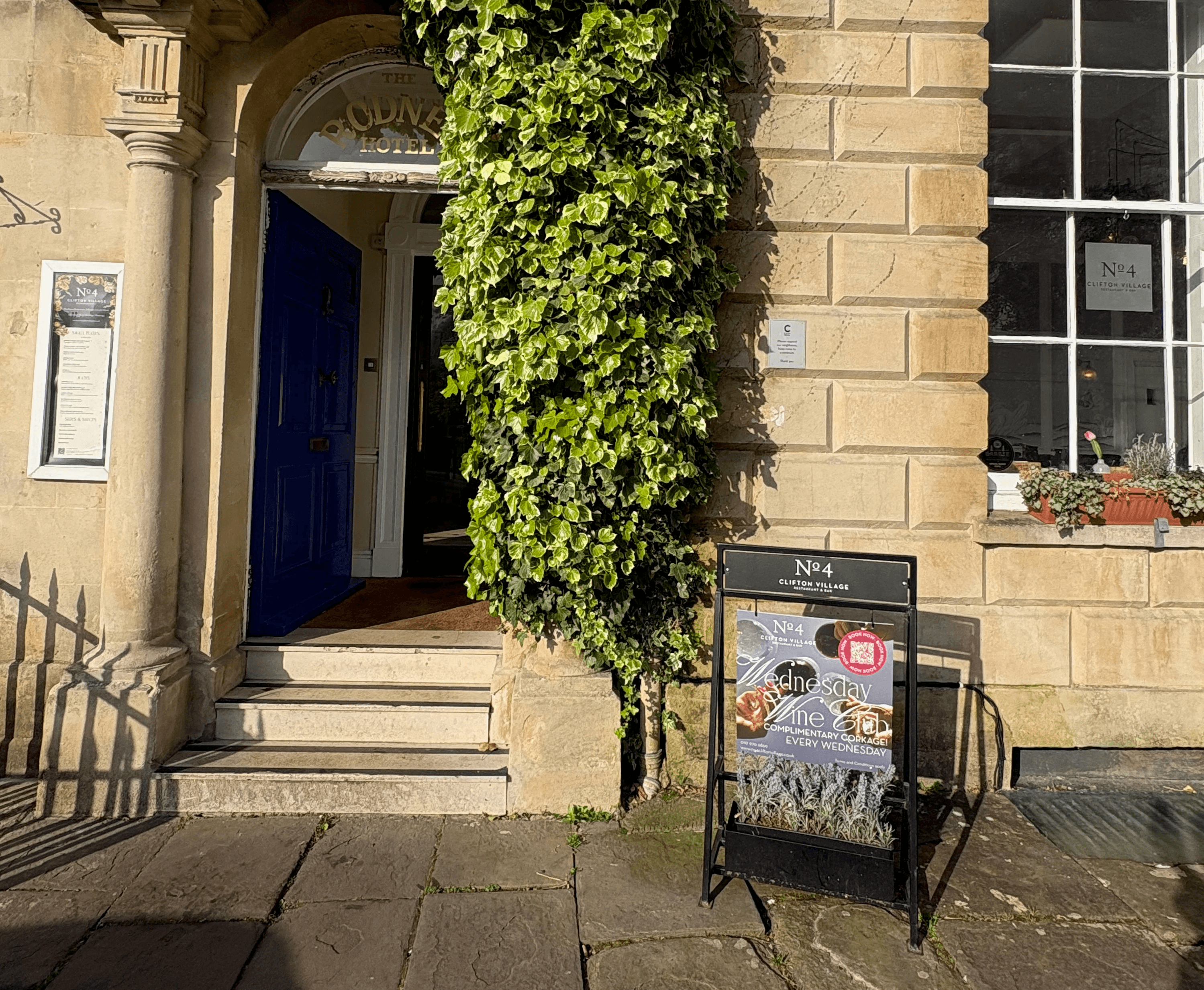
Wine Wednesdays was already running, but weekday trade was lagging and most people walking past had no idea No.4 was a restaurant. Set back from the street with no other food businesses close, people easily mistook it for part of the hotel rather than a destination in its own right.
The brief: give the promotion enough print presence to stop people and make them think, oh, there's a restaurant in there.
Deliverables: A-board (square), poster (A3), flyer (A5, double-sided)
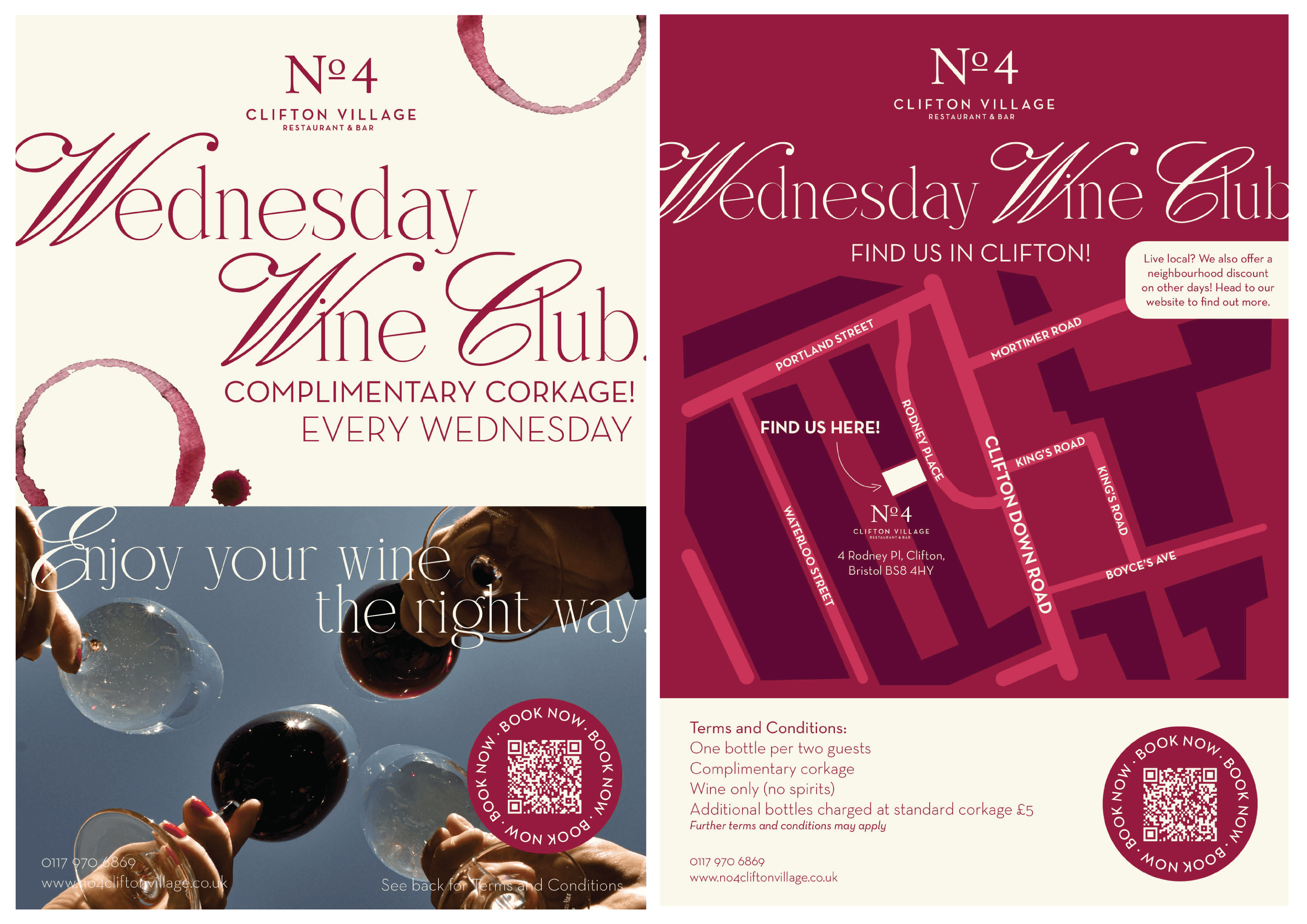
The design leans upmarket rather than casual. Wine stain rings and a flowing script wordmark position Wednesday Wine Club as an occasion, not a discount night, giving No.4 a 'best in Bristol' feel rather than a bargain promotion.
No.4's manager arranged a joint distribution deal with DBM Wines, an independent wine shop just around the corner, so their customers would leave with a flyer for No.4 in hand too.
I designed the flyer to work specifically for that handoff, giving the back a clear map and address rather than assuming people already knew where No.4 was
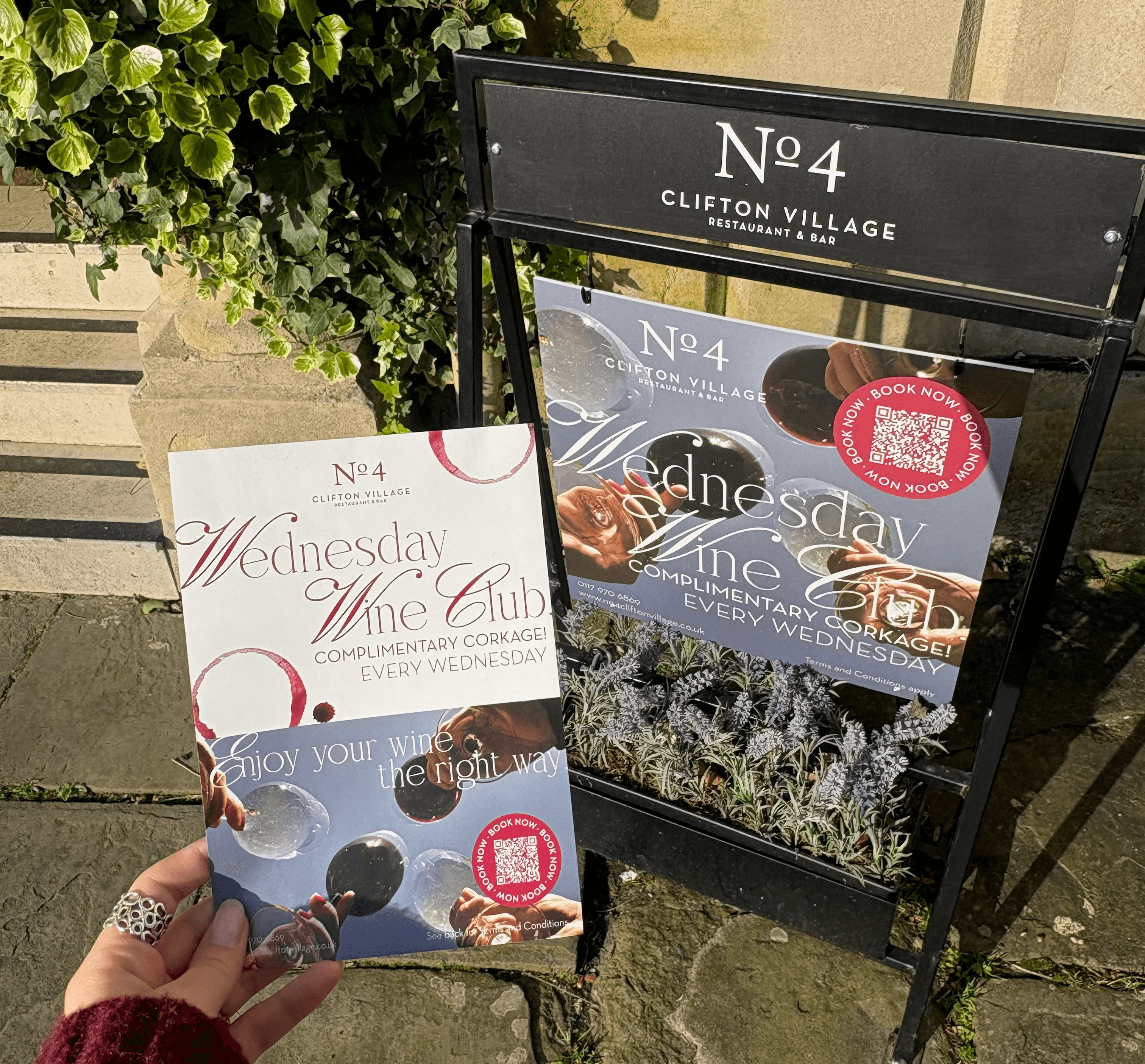
All collateral carried a QR code linking straight to booking. I wanted anyone who stopped to look to be able to act on it immediately, not have to remember to book later.
The back of the poster also carries a neighbourhood discount for non-Wednesday visits, aimed at locals near DBM Wines. The hope was that spotting a discount on their own doorstep would turn a one-off wine night visitor into a repeat customer.

The design went down well with the team, and Wednesday Wine Club is still running today.
Burns Night
Burns Night runs every year, but this was my first one since joining the team, and I wanted it to feel personally thought through for every guest rather than repeated from the year before. Sitting in one of No.4's quieter months, it also needed to feel like a bigger occasion than the venue's usual calendar to earn its place.
The brief: turn a fixed tasting menu and wine flight into an experience that felt curated for the table, not just served to it.
Deliverables: full menu booklet, A-board, event webpage design (developed by marketing manager/web designer)
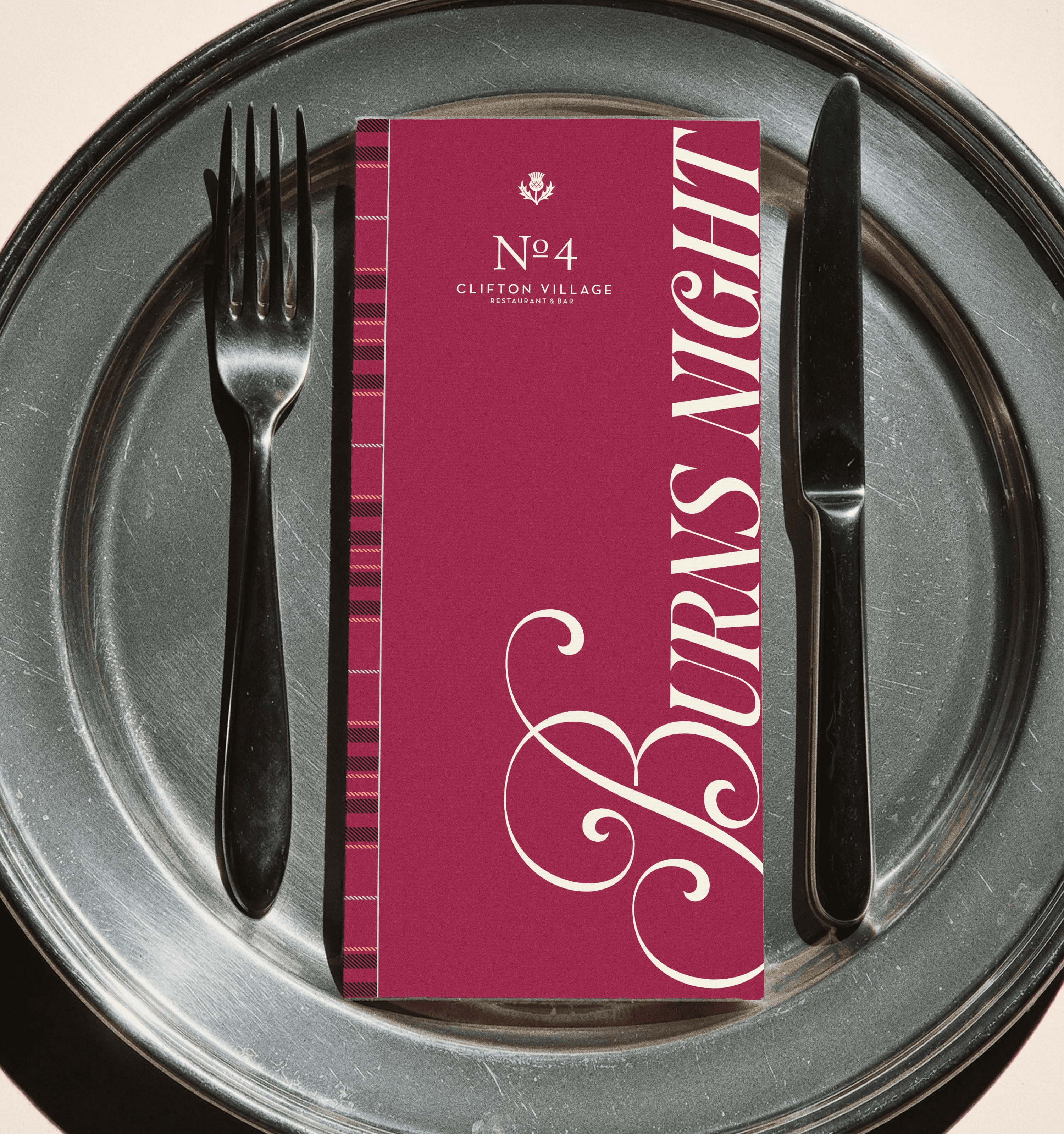
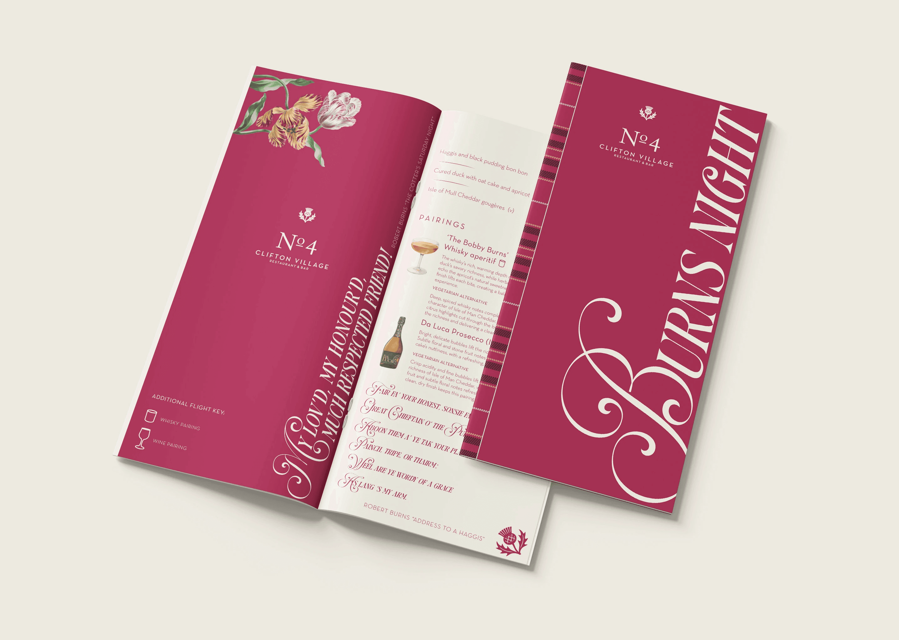
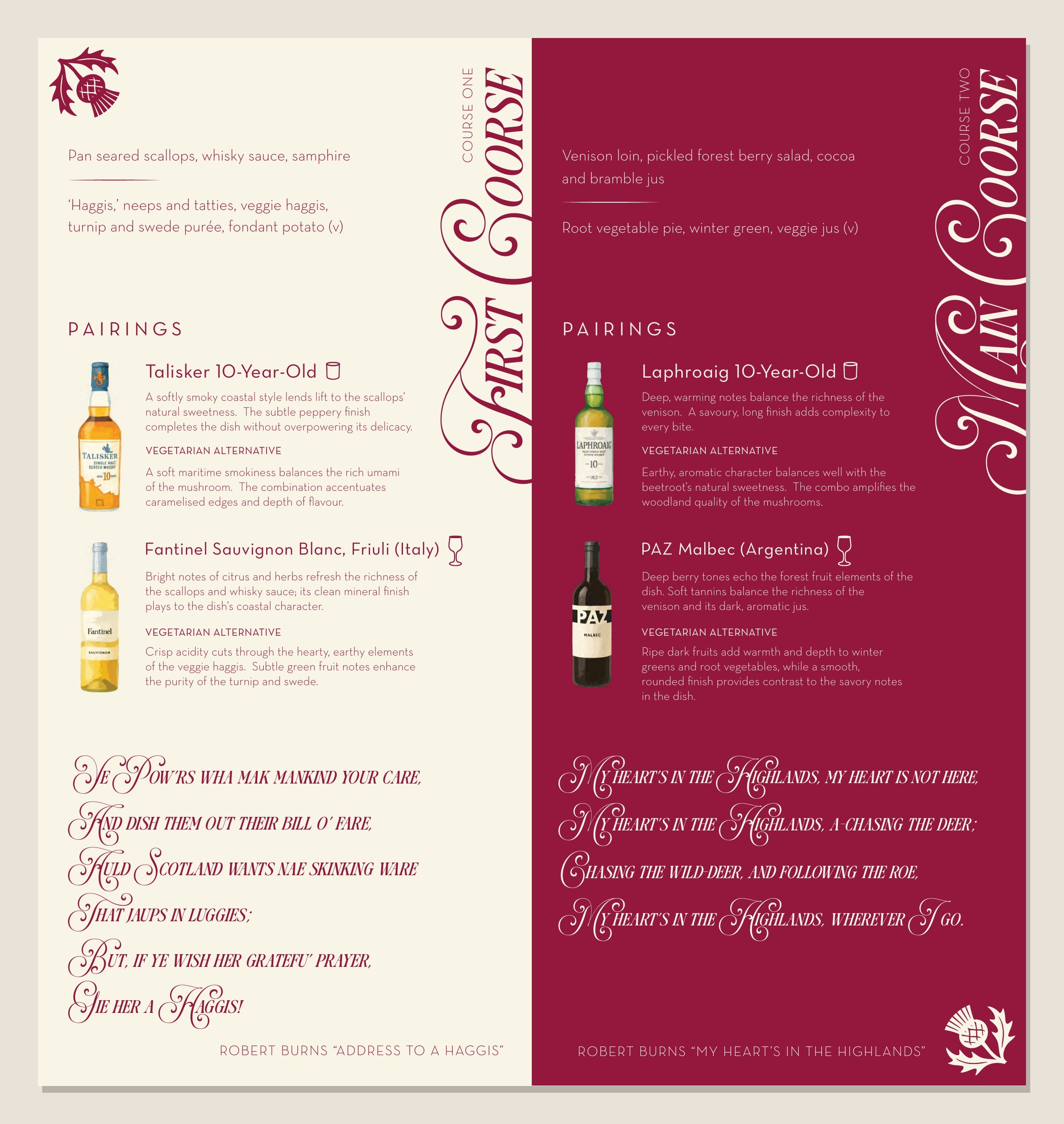
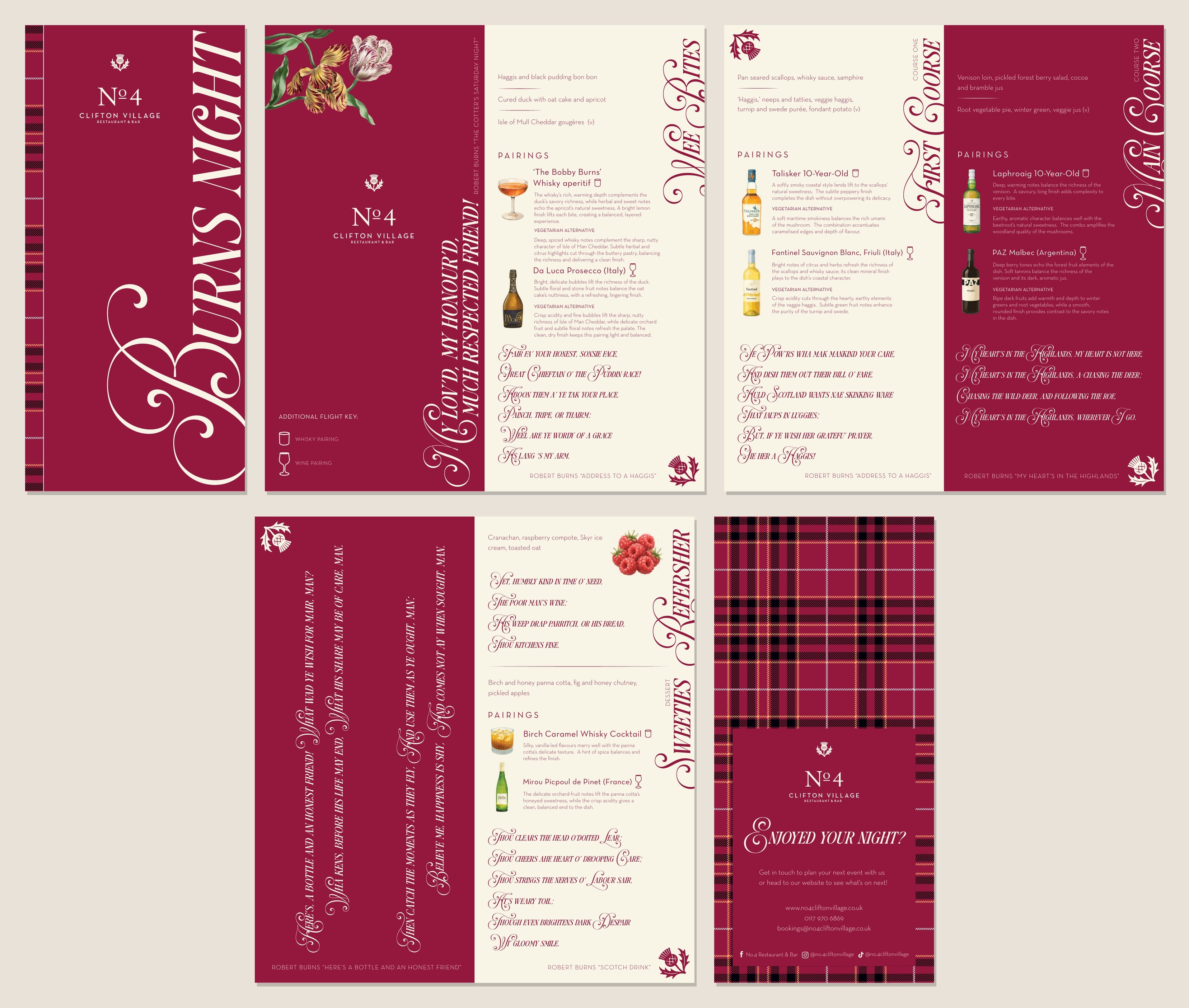
For the concept, I treated each course as its own chapter rather than a line on a menu. Every dish sits next to an extract from Robert Burns chosen to match each course which also had its own wine or whisky pairing, so guests read a few lines of poetry before each course arrives instead of just seeing a description.
The tartan pattern, identifiably No.4 painted botanical illustrations, and thistle icon were chosen to feel like considered Scottish detailing rather than a generic Burns Night cliché. I built it as a full booklet rather than a single sheet so it felt like something worth keeping, not something that gets left on the table.
For rollout, promotion split between print and web. Two A-boards went out on the street, one a short walk from the venue to catch people before they arrived, and a smaller square board right on the kerb outside, giving pedestrians two chances to notice the night was on.
Our marketing manager built the event page itself, the concept I created in Adobe XD and design assets I supplied to keep it consistent with the printed pieces.
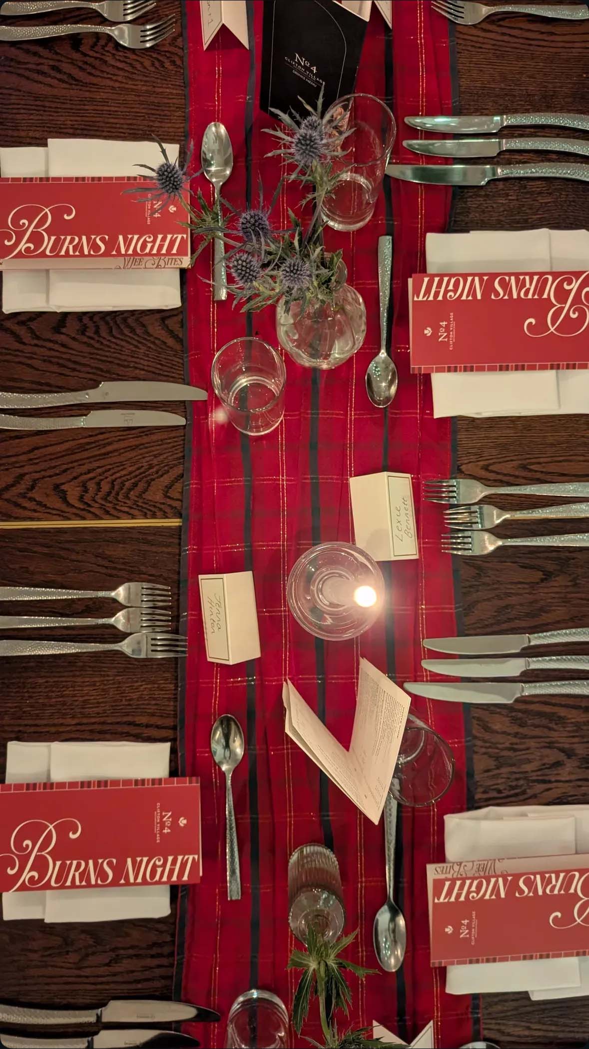
The night sold out, and plenty of guests took their booklets home with them rather than leaving them on the table. No.4 Clifton Village also picked up some good reviews off the back of it.