Highmark Homes
A New Zealand residential building company Highmark needed a brand that felt professional, approachable, and grounded, something that could live on fence signage, social feeds, and everything in between.
Brand Design

Project Overview
Client: Highmark Homes LTD
Industry: Construction
Goal: Refresh identity for a residential building company in New Zealand, ensure it aligns with their evolved values and services
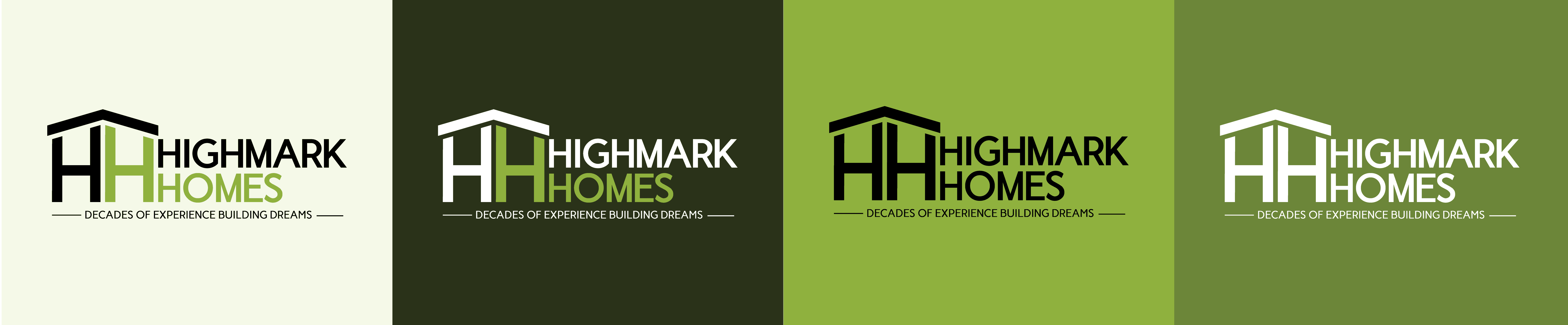
I gave Highmark Homes a full brand refresh, designing their new identity to reflect the company's practical and people-first approach to residential building. I wanted to make sure the system was confident and clear so it could work well on a construction sign as well as on their social media.
From brand rollout to everyday content, the visuals aim to feel considered, approachable, and built to last.
Brand Identity
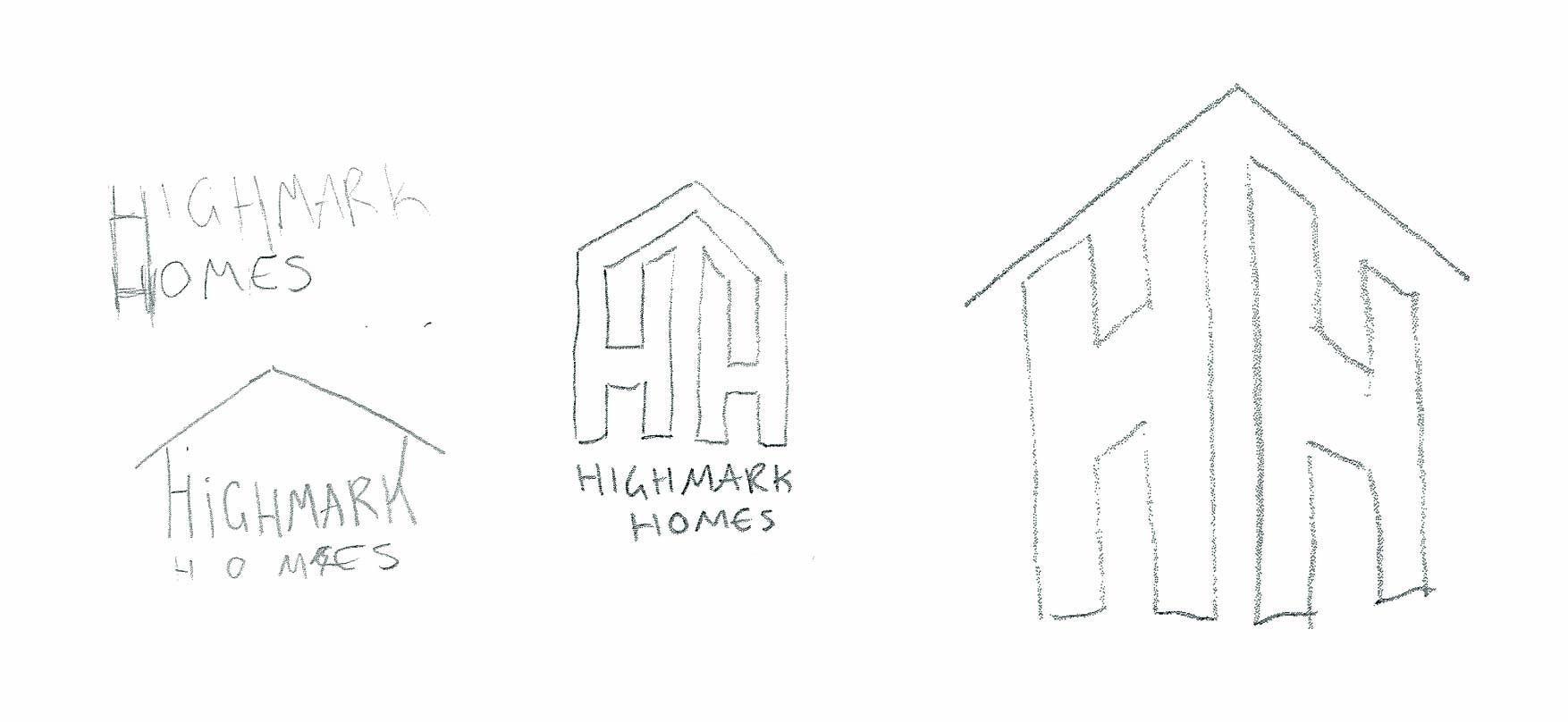
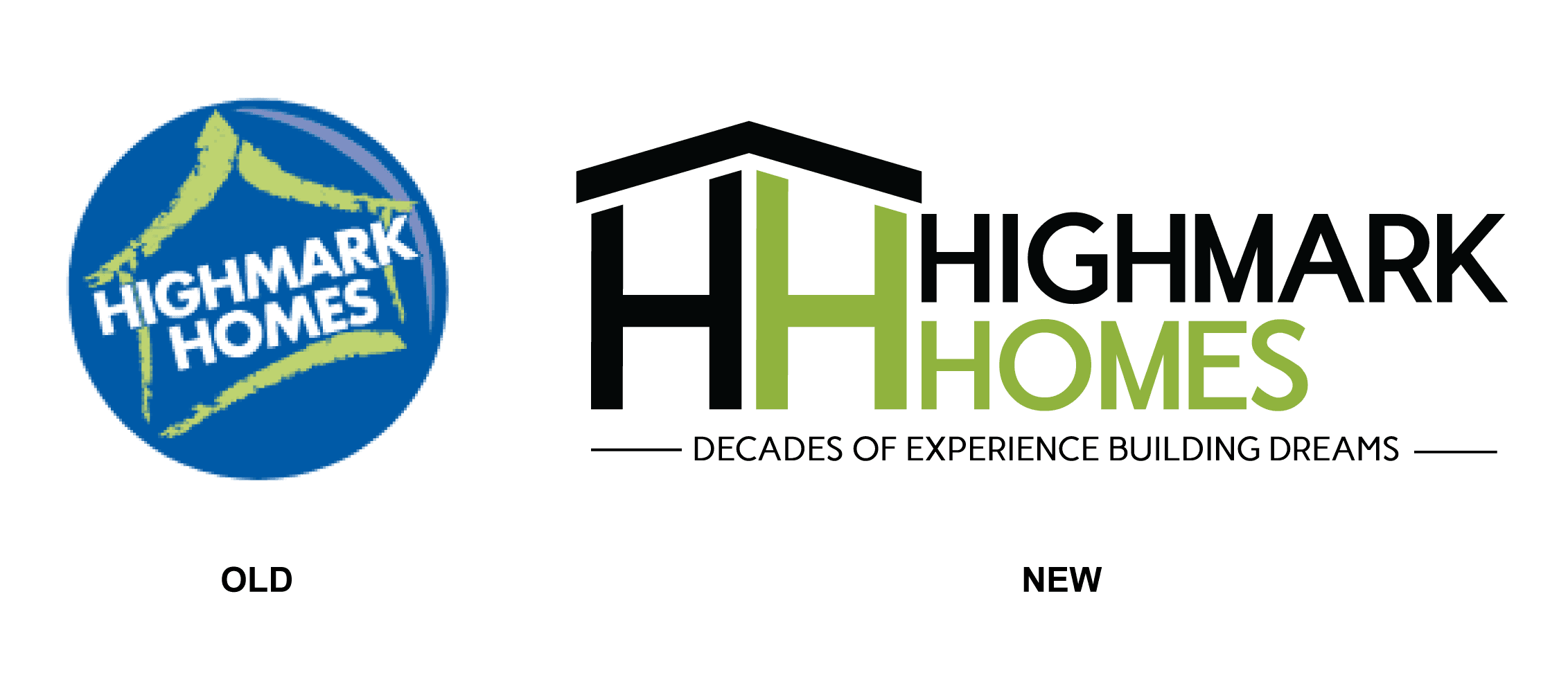
Highmark was already working with a PR agency when they asked them to develop a new logo and brand identity. I created the starting sketches that went to the agency, and stayed involved throughout their process, weighing in on decisions as the logo came together.
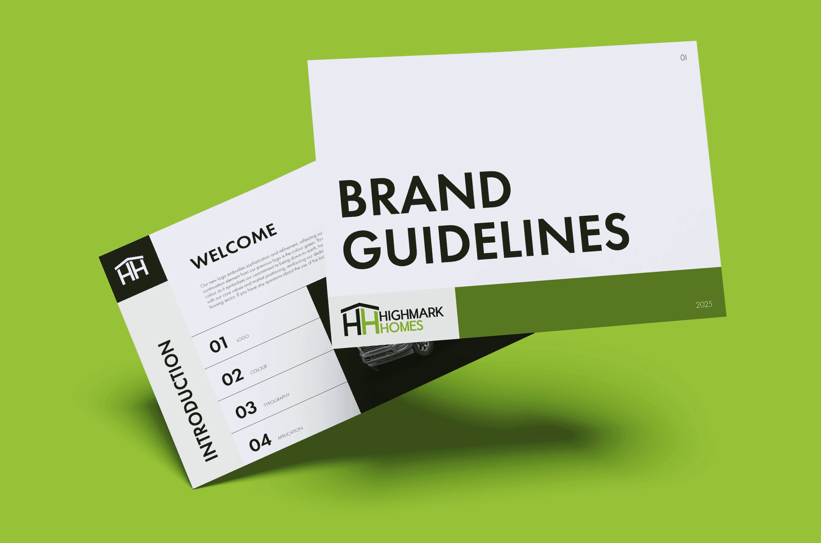
By the end, Highmark felt the identity had been rushed, the logo didn't have a proper system behind it for how it could actually be used. That's where I came in: I built the brand guide, an 8-page document covering logo usage, colour application, typography, tone of voice, and everyday brand roll-out, and helped Highmark work out what applications they actually needed.
Applications
I designed the full suite of applications, uniforms, vehicle signage, business cards, and print collateral, to feel bold, legible, and instantly recognisable, whether it's on the road, on-site, or in someone's hands. Using the refreshed logo, colour system, and clear layout, I kept everything clean and confident, no clutter, just a strong presence that feels consistent with the brand.

Design & Build Booklet
I created the Design & Build booklet as a lead-generating tool, giving potential clients a clear picture of what working with Highmark looks like.
It’s designed to simplify the build process without dumbing it down, making the journey feel less overwhelming and more achievable. Visually it uses clear hierarchy and friendly language, well-paced sections to guide the reader through each stage.
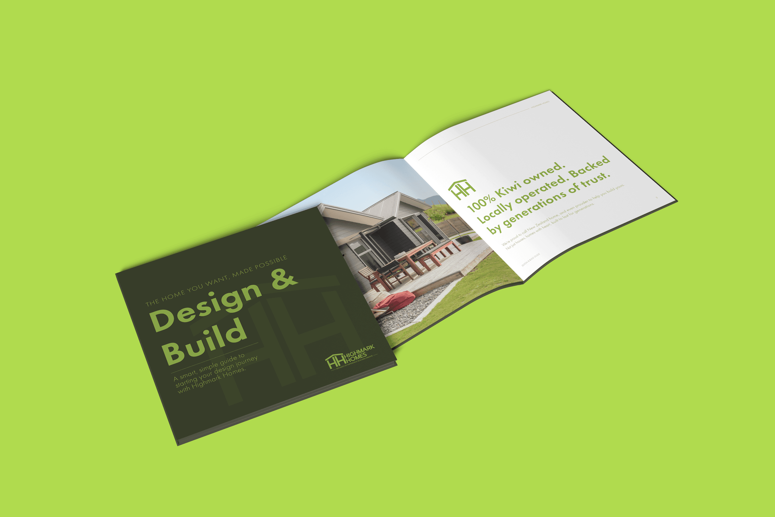
From the initial inspiration to handing over the keys, the booklet helps Highmark stand out not just for what they build but for how clearly they communicate it. Full digital here.
After this I used it as a template for other booklets to help Highmark with their communication with clients and potiential clients, keeping the same system consistent across everything Highmark put out.
Social Media
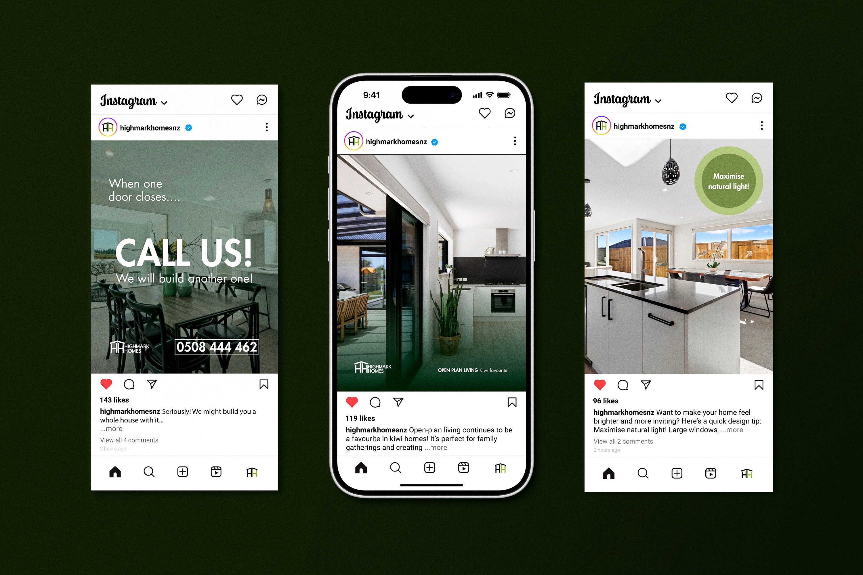
I designed Highmark's social media to speak confidently to first-home buyers without losing the practical tone of the brand.
I introduced a slightly deeper green just for social media, to add contrast and give the content a more modern edge.
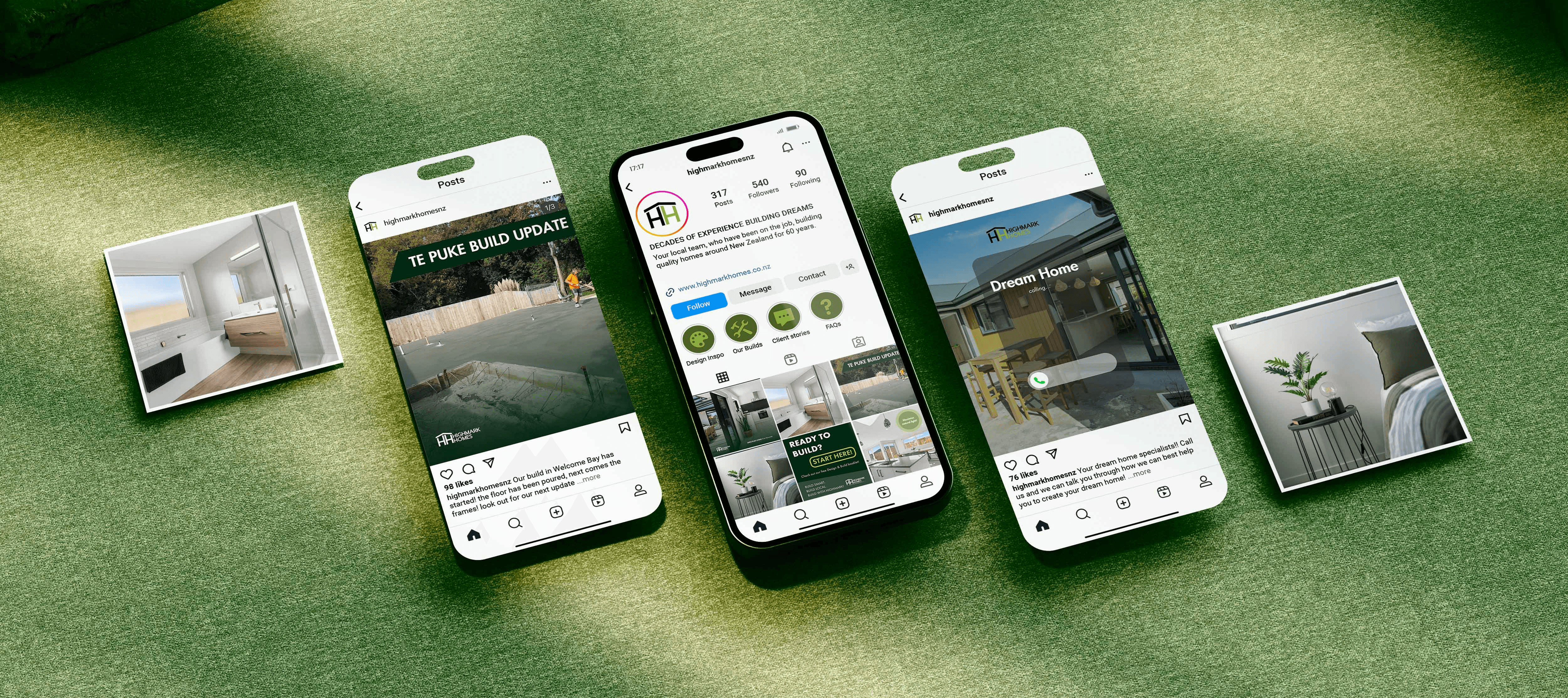
I built the visual system to be flexible across formats, whether it's showcasing a new build, sharing tips in a carousel, or running ads. It's easy to read and instantly recognisable as Highmark.
Overall, it feels fresh while staying clear and consistent.