Rebel Roast
Rebel Roast, a fictional cold brew coffee brand, needed a full visual identity and packaging system that could cut through the earthy minimalism of specialty coffee. Bold, disruptive, and impossible to ignore on shelf.
Packaging Design
Project Overview
Industry: Beverage / Packaging
Goal: Build a full brand identity and packaging system for a cold brew coffee brand bold enough to stand out against specialty coffee's usual muted, earthy look.
Rebel Roast started after I finished university. I wanted a project that would let me build a full brand identity from nothing and keep developing my skills outside of client work, so I set my own brief and took it from naming through to final packaging.
I began broad, exploring wordmark treatments, icon studies, and a tagline before narrowing down to four concept directions.

I developed one further with a coffee bean icon, a colour palette, and supporting assets, but it wasn't working, so I went back to the remaining concepts and kept refining.
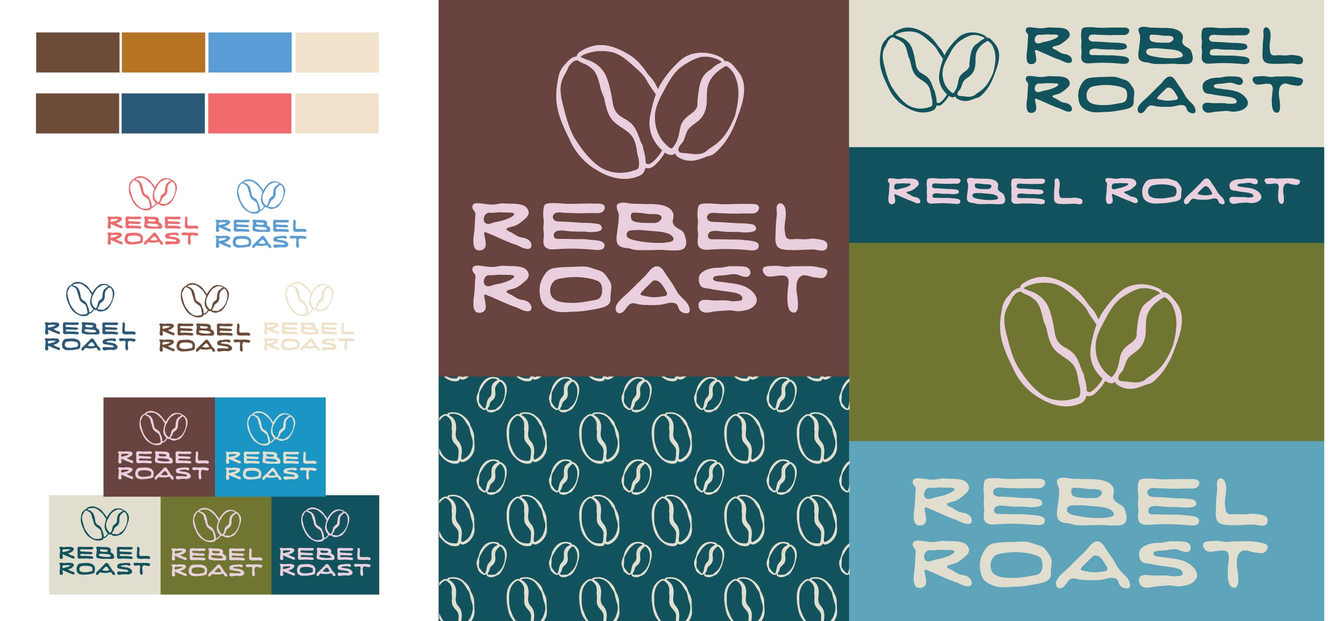
The direction clicked once I drew the small cold brew coffee mark and paired it with the right lettering.

The first full colour direction I developed was a muted palette, teal, olive, and light blue, paired with the cold brew mark and cream lettering, on a smaller can size.
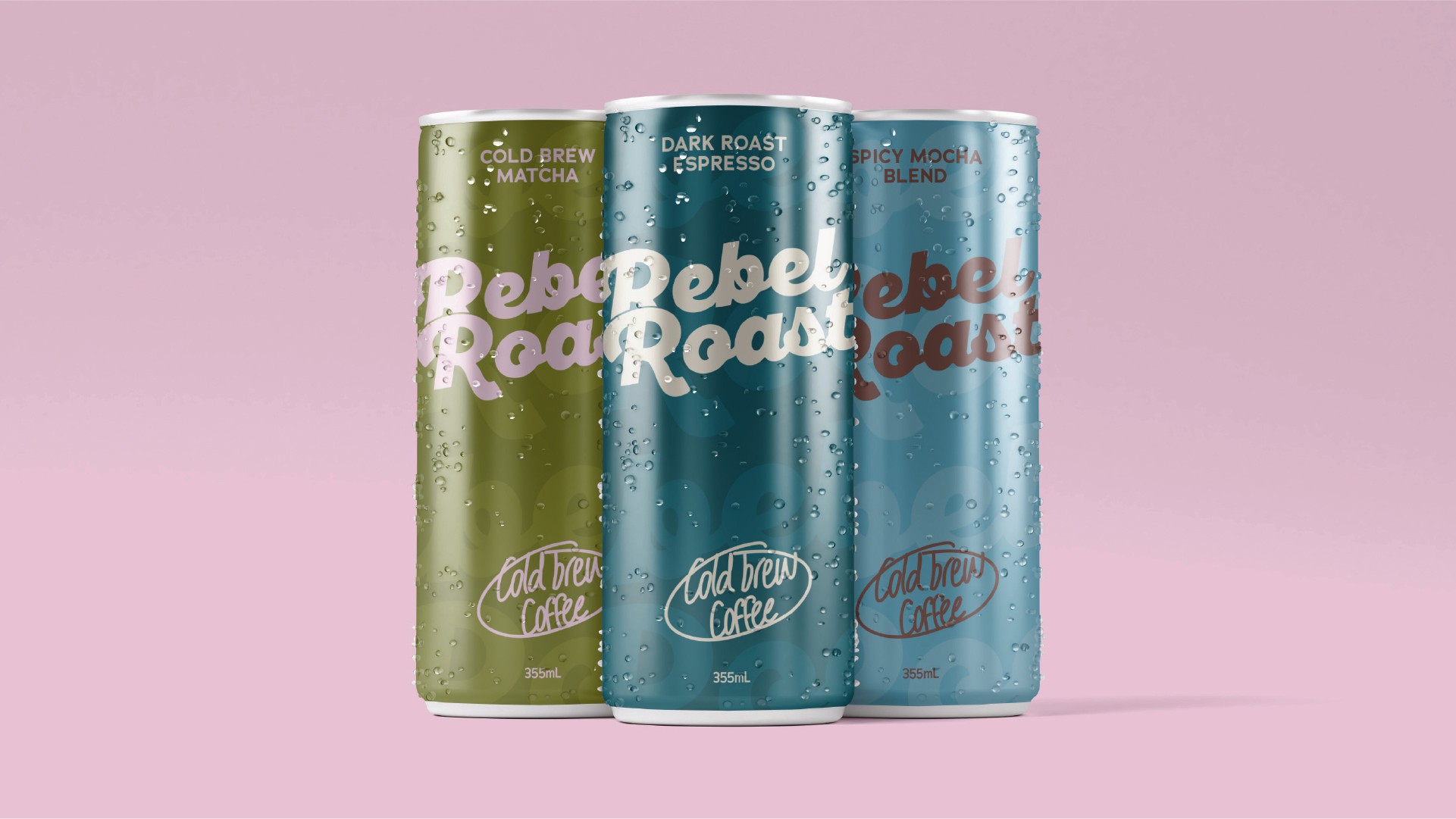
I shared this version on social media and added it to my portfolio. I wasn't fully happy with it though, so I moved on to a bolder colour direction. This was where the real bold and controversial colour came in.
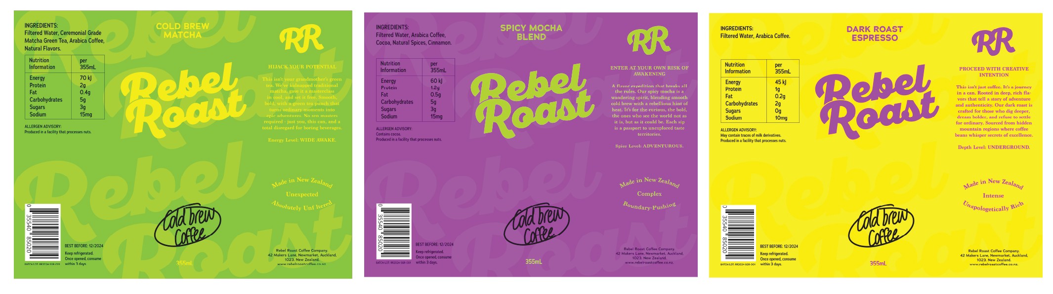
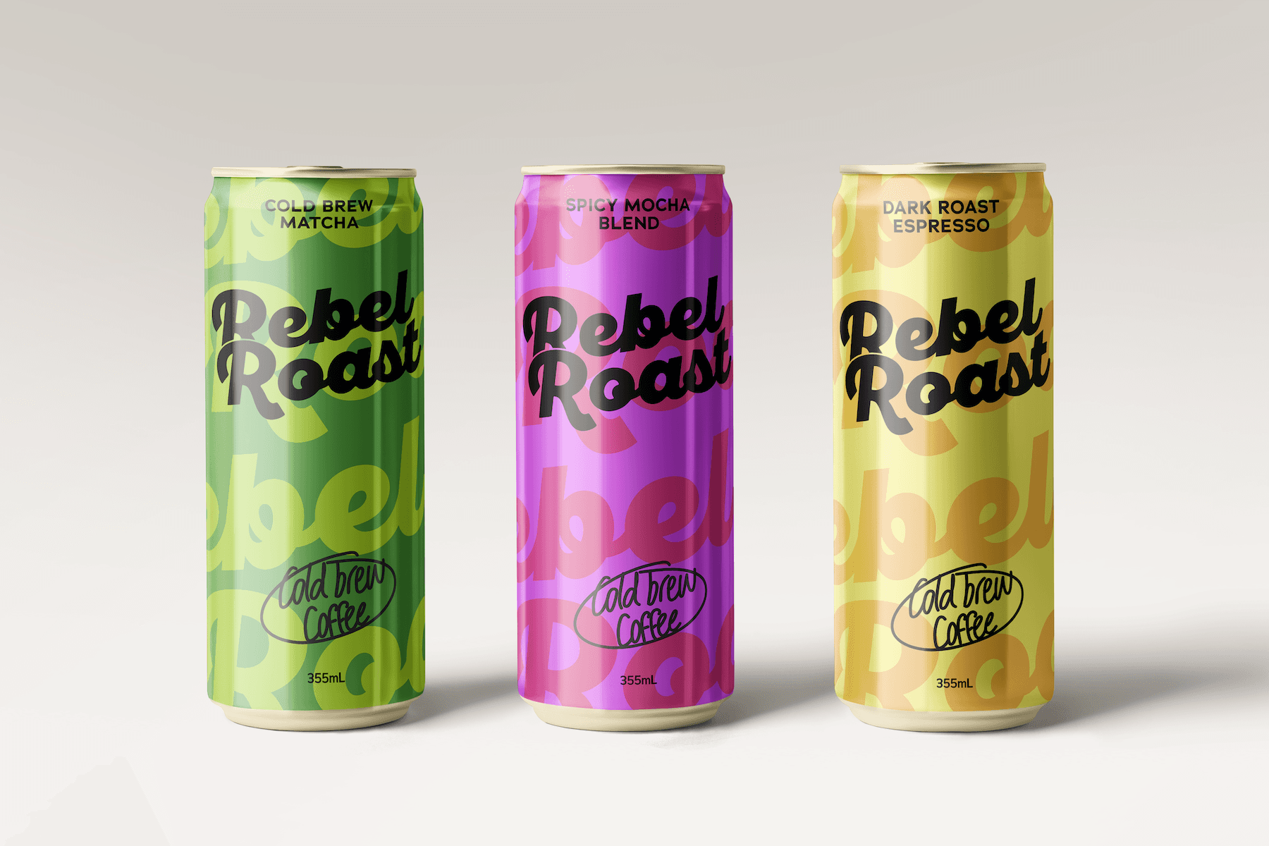
For this direction, I tested brighter lettering and loud, punchy copy on the flat can labels. This stage stayed as flat artwork and never made it to full can mockups. I then switched the lettering to black, it read far stronger against the saturated colours, and that became the version live on the cans today.
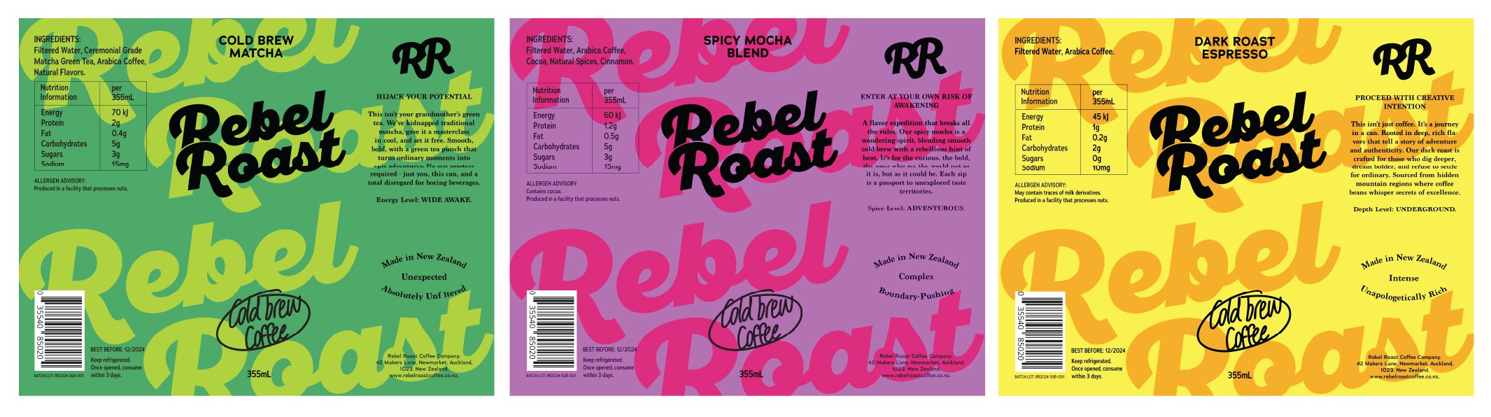
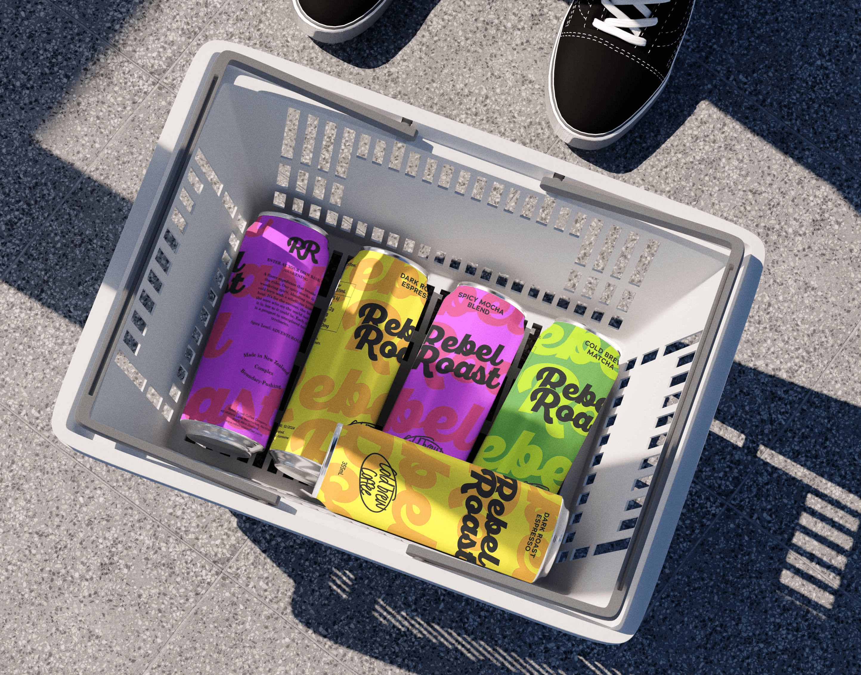
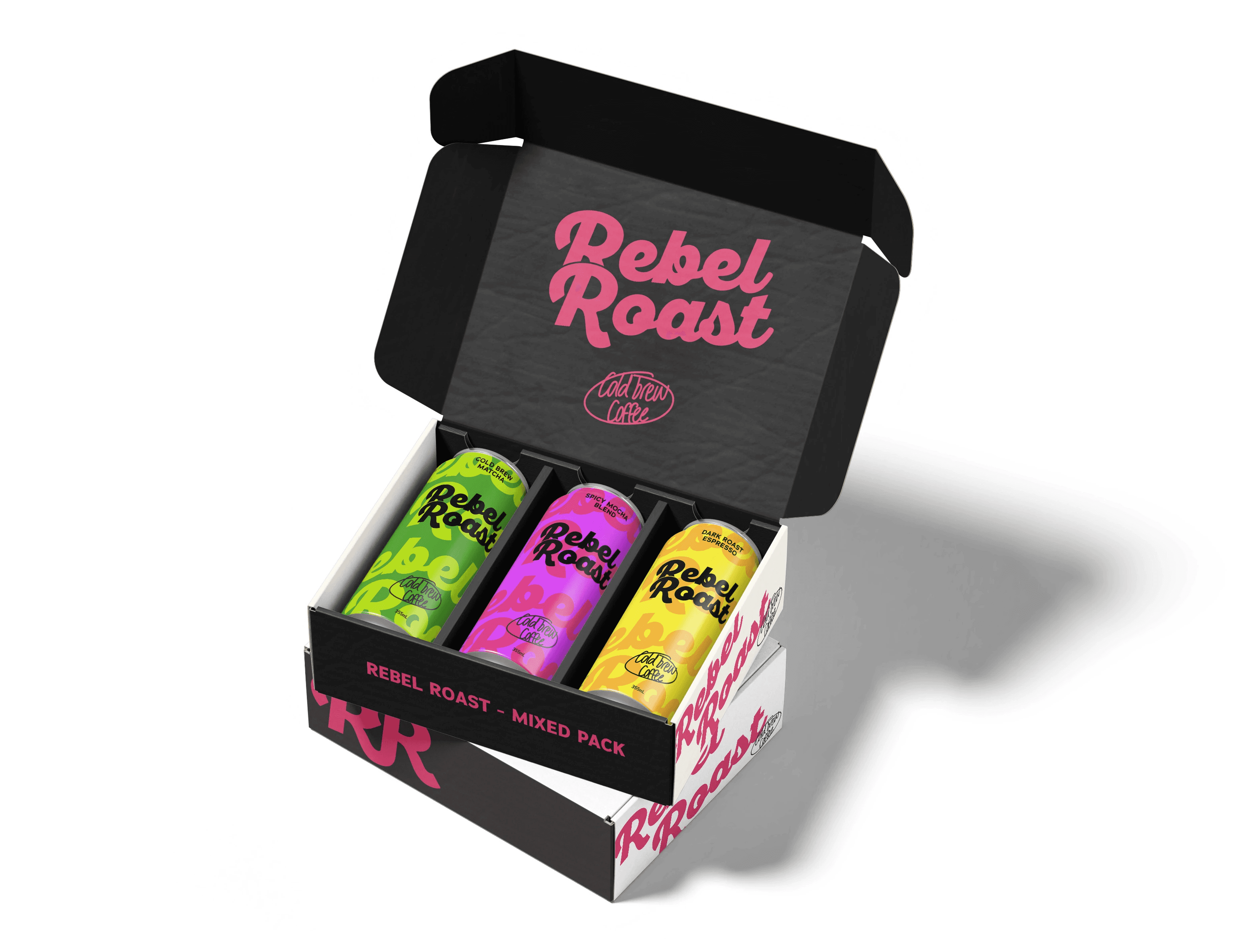
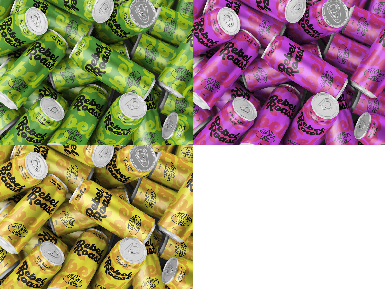
Three flavours, three colourways!
Cold Brew Matcha, Spicy Mocha Blend, and Dark Roast Espresso
Each with its own energy while sitting together as an unmistakable family on shelf.