Pizza On The Park
Pizza on the Park, a Bristol pizzeria, had outgrown its materials. It needed brand applications with the same fun, inviting personality as the restaurant itself. New menus and pizza boxes brought consistency and energy to every customer touchpoint.
Print Design

Project Overview
Client: Pizza On The Park
Industry: Hospitality
Goal: Design a cohesive suite of brand applications, including menus, pizza boxes, and supporting illustration, that reflected Pizza on the Park's identity while giving each touchpoint its own personality.
Pizza on the Park is a premium-casual Bristol pizzeria built around great food, community, and a relaxed atmosphere. The existing identity was strong but limited relying heavily on a single motif, and held back by print materials that hadn't kept pace with where the brand wanted to go. The challenge was to evolve the identity into a more versatile and contemporary system while retaining the character that customers already knew and loved.
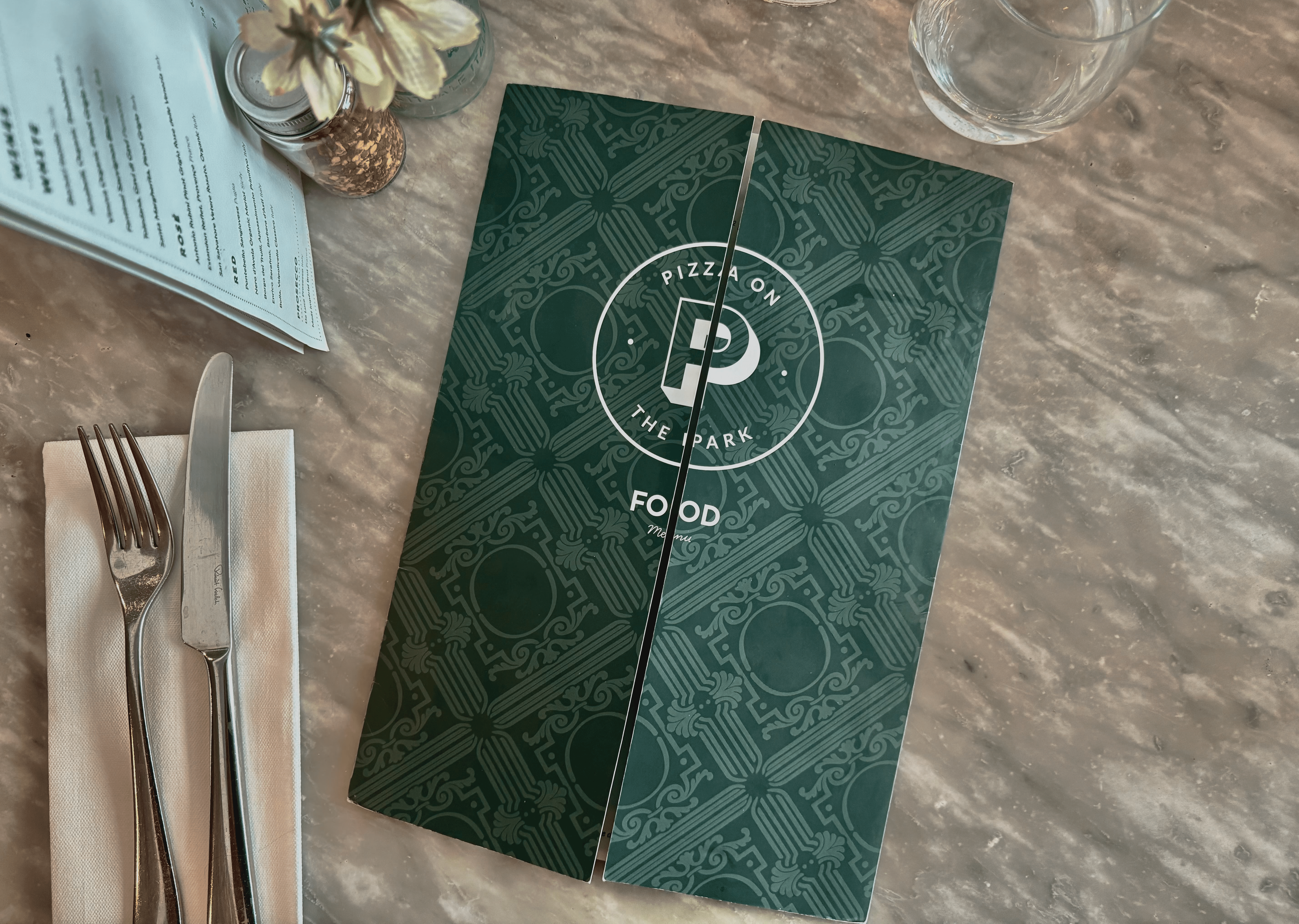
I focused on expanding the illustration suite, refining the typography within the existing brand framework, and rebuilding print collateral across menus, pizza boxes, and in-venue materials. The goal was a system that could flex across different formats and occasions while keeping its personality.
Old Menu

The existing menu had a strong foundation but lacked visual flexibility their single signature citrus motif carried all the personality, leaving little room for the brand to breathe or evolve across different formats
New Menu

Visual Direction
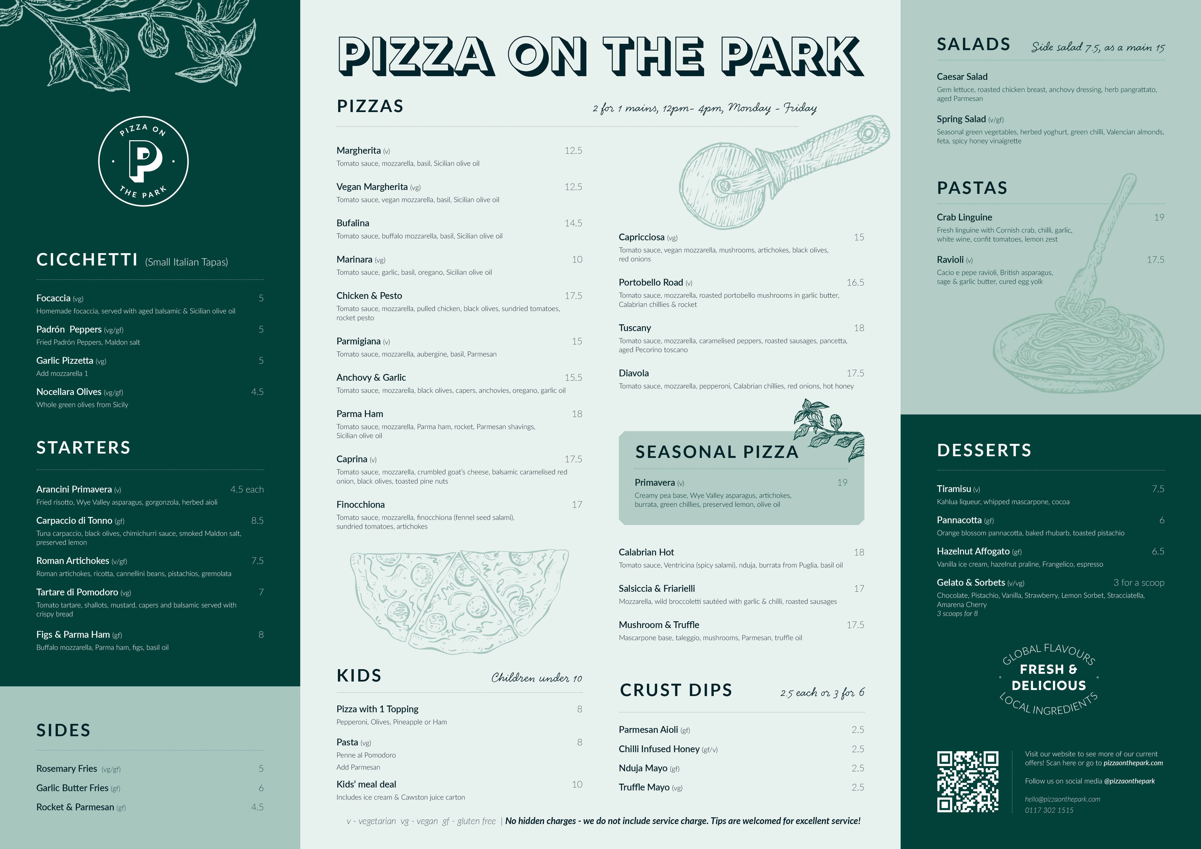
The existing illustration suite was refined and expanded, moving from a single signature motif to a broader system of hand-drawn botanical and food-led motifs, giving each section its own visual moment while holding together cohesively.
Typography and layout were restructured to balance personality with clarity across a much denser amount
of content.
Layout & Function
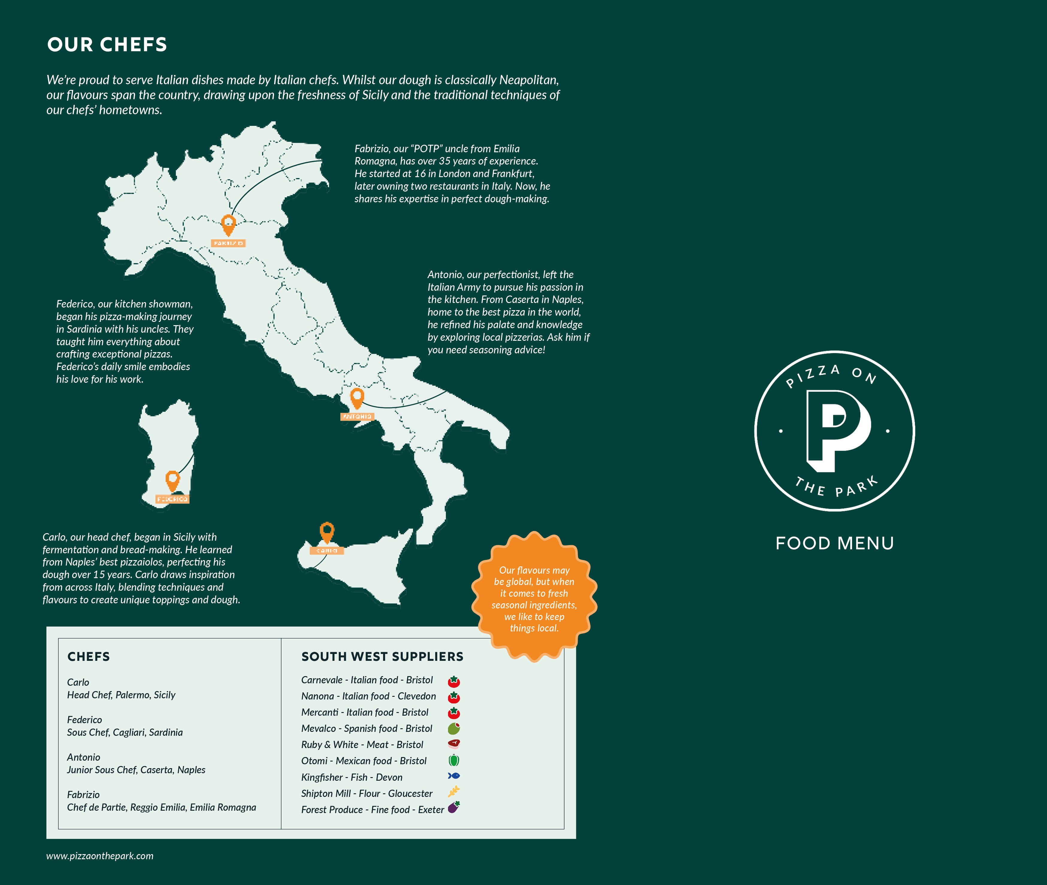
The original single-fold format was cramped and limited. Scaling up the format created space for considered hierarchy and a cleaner reading experience. The Italy illustration was pulled back to let the chef stories and supplier information lead, giving the back panel a warmer, more human feel.
Pattern Creation
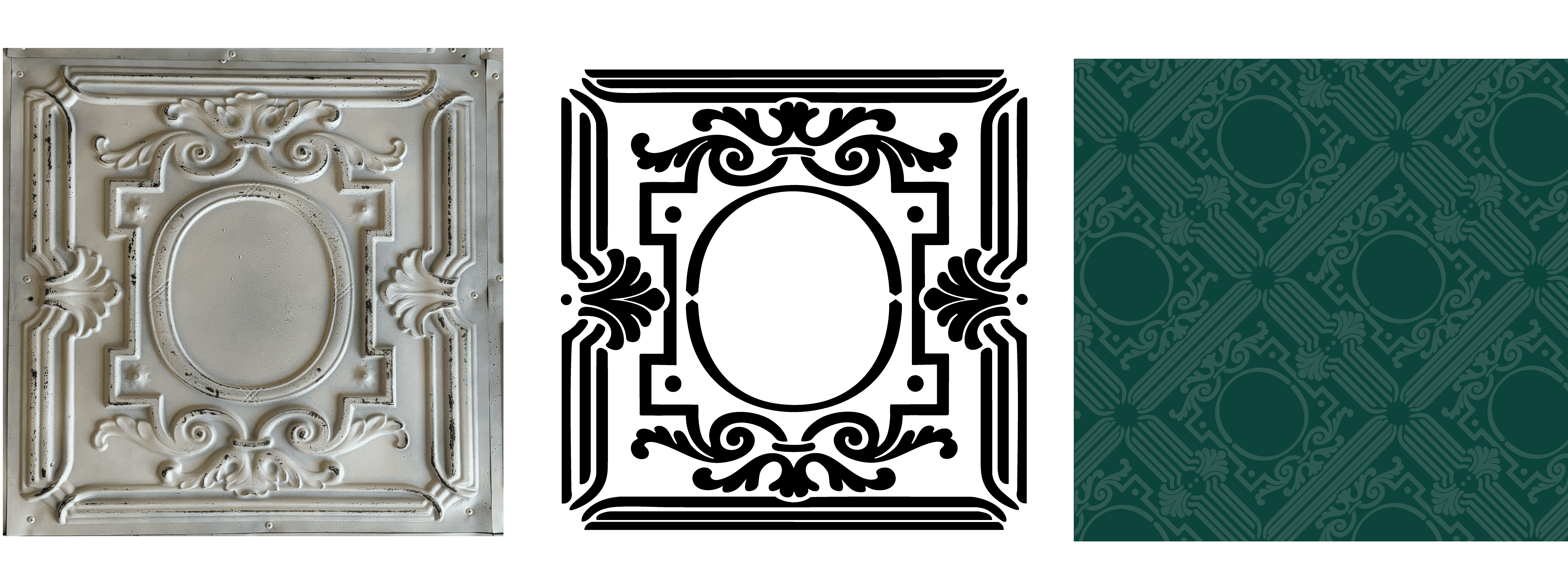
Shown here from reference photograph to redrawn vector to final brand application, the pattern now appears on the menu and can be used as a unifying texture throughout the system.
Illustrations
The illustration suite was expanded from a single citrus motif into a full system of hand-drawn botanical and food-led icons: basil, tomatoes, wine glasses, pizza slices, pasta, and more. Each motif was drawn from inspiration within the venue itself, using the ingredients, glassware, and atmosphere found at Pizza on the Park rather than generic Italian restaurant imagery.
The result is a set of illustrations that feel specific to this restaurant and not borrowed from a style library, but developed through the brand's own identity.

Pizza Boxes
The box design extended the brand system beyond the restaurant, turning every takeaway order into a brand touchpoint. The signature dark green was carried across the packaging, with the logo centred on the lid and bold typography on the sides ensuring the brand is legible from any angle.
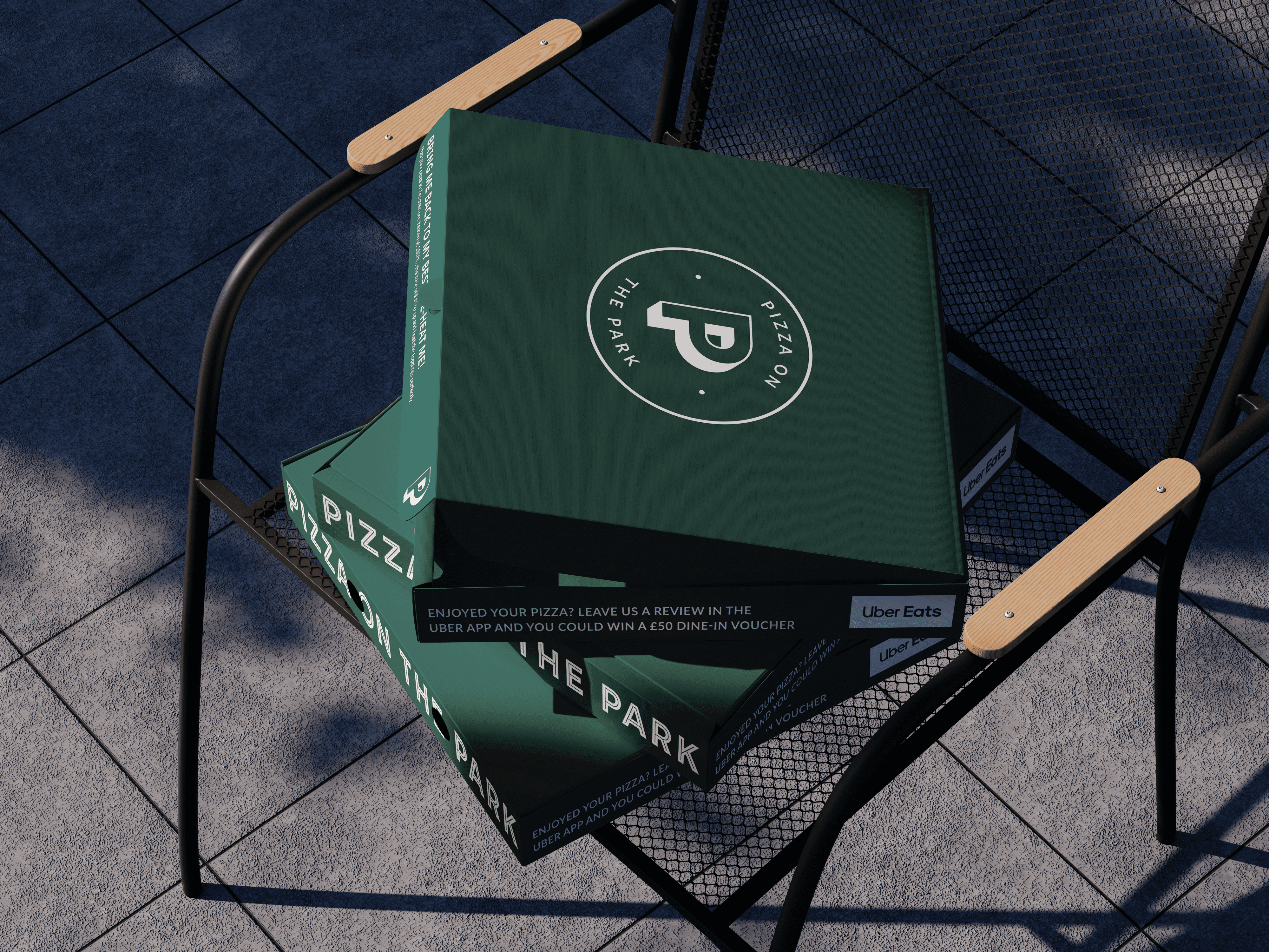
Every panel was considered, the inside lip carries reheating instructions ("Bring me back to my best!"), the outside promotes the Uber Eats review prompt and logo, and the opposite side reads "Good things come in green boxes."

Functional in every aspect, but with personality!
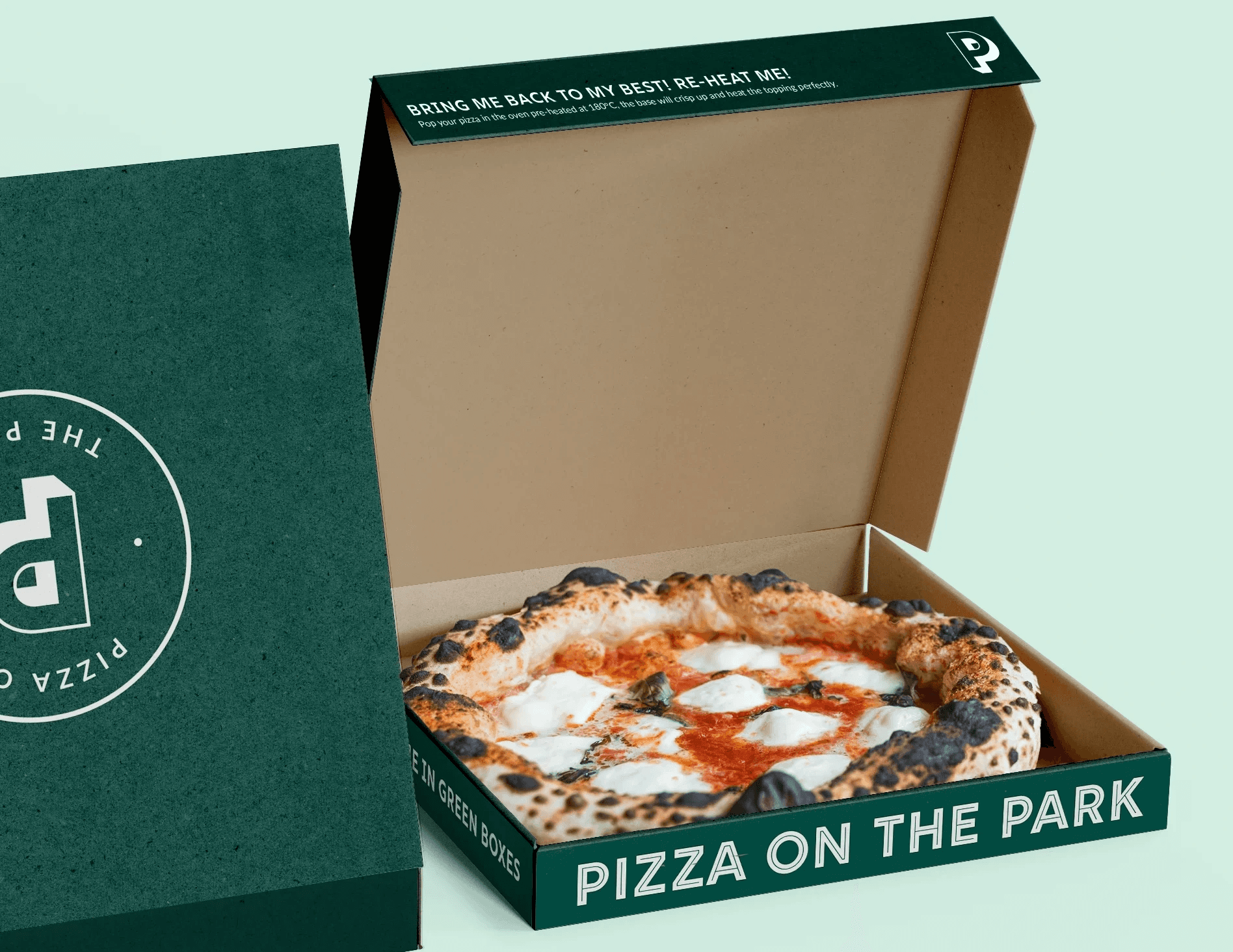
The result is packaging that feels premium without losing the brand's down-to-earth character, something a customer will want to photograph instead of throwing away.
Full Menu Suite
